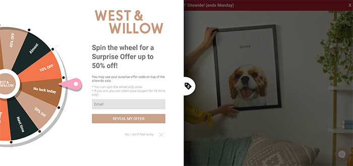
It is quite important to style Wheelio to suit your brand colors and overall brand feel & communication tone, since you don’t want the pop-up (any pop-up) to look like a spam window you got from a shady site. West & Willow did a great job with their styling and the overall look totally looks like their styling.
Lets go a bit more in detail:
Communication on the pop-up itself is also really important. W&W communicates that you can with a surprise offer up to 50% off and you can clearly see the discount on the wheel itself. Why is that important you say? Well the users subconscious tells them they have a chance to win big discounts, up to 50% and they are more eager to play, since they see it being represented on the wheel when they look.
They also did a great job with the CTA (Call to action) button, saying REVEAL MY OFFER, which is way better than just “SPIN” since it adds a bit of mystique to the offer, making it a bit more appealing.
This may seem like small things, but on the bigger scale of things, they really matter and have a huge impact on your bottom line.